THE IMPORTANCE OF BRAND IDENTITY – Step 2

The Visual Identity
In this part we address an important aspect of brand identity, the one relating to visual elements such as image, logo, colours, which immediately identify the brand in the eyes of the public. These aspects are tangible elements that have a strong effect on the perception of a business because they are the first to attract attention. They are the direct representation of a brand, the signs that the public recognizes.
What are the main visual elements?
- Logo
- Corporate Colour Palette
- Typography
- Type and Style of Images
- Packaging
- Design – Graphic Aspect (website, app)
- Other Marketing Materials.
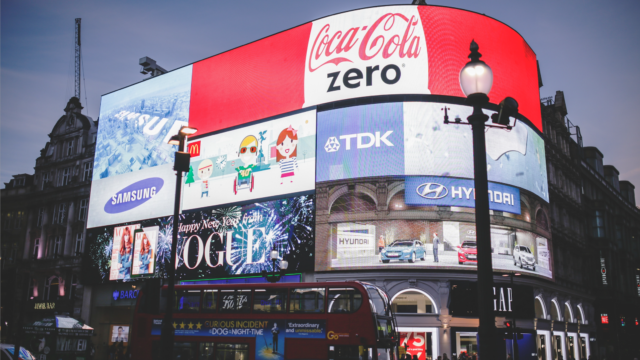
Think of logos and colours like the bitten apple of Apple, the monogram of Luis Vuitton, Facebook logo with the use of blue, etc.
All visual elements, as well as those already seen for the content, must respect only one rule: consistency.
It is a serious mistake to give a message in the value proposition and then have a visual identity that makes you think in other directions.
LOGO
The logo is meant to be remembered, to show everyone the personality of the brand and must last over time.
It’s mission is to immediately communicate «the soul» of a brand: serious and classic, or friendly and trendy, innovative, artisanal, futuristic, or other.
Some tips for an effective logo:
- it must be simple
- attractive and without “tiring”, that is to say, it must be able to remain relevant over time.
For every sector there are always standards in visual elements, both in graphic signs and in colours. Playing with industry standards (for example, blue in the technological sector or green in the pharmaceutical sector) is absolutely possible, indeed highly advisable to stand out, the important thing is to subvert canons with a reason and a message, ie do not choose graphic signs or colours at random or simply because they like.
ES: AIRBNB logo
The idea of the logo starts from the signs of a heart, people and places, and is perfectly consistent with the storytelling of the brand “Belong Everywhere”.
Even the chosen colour evokes the same type of emotion as the graphic sign.
COLOUR PALETTE
People have different psychological ties to colours. The choice of colours for the brand must be made in a strategic way, respecting the identity and mission of the company and the world it intends to “evoke”.
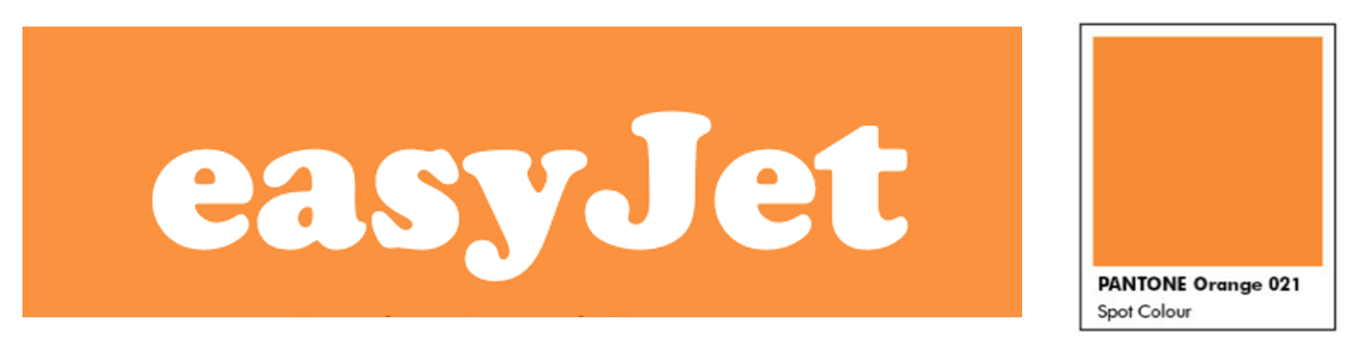
Check out these logos
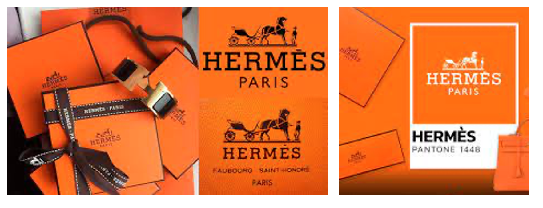
The orange colour of Hermes (Pantone 1448) is a “saturated” and deep nuance, which coupled with brown gives elegance and a classic taste to the logo.
Easyjet’s pantone Orange 21, on the other hand, is a very bright and modern tone which, together with white, gives a dynamic character to the logo.
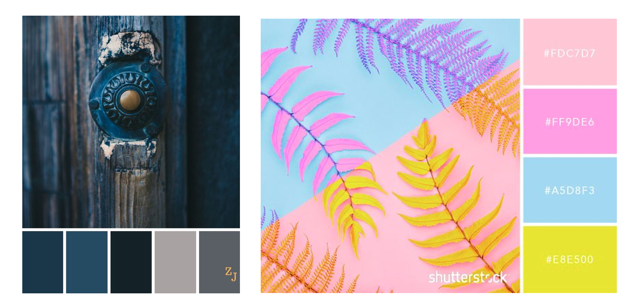
If we compare the following colour palettes we realize that the sensations they give off are quite different. To communicate professionalism, elegance or long-term vision, a choice of saturated and classic colours is very suitable. More fluo, cold, bright colours are suitable for communicating innovation, freshness, dynamism or even a youthful mood.
TYPOGRAPHY
The typography specifies the fonts to be used in communication and the dimensions, spacing, capital letters and each element referring to the texts.
Typographic specifications keep the characters of a brand consistent, make them recognizable.
Which fonts to choose?
- Serif fonts have small vertical lines at the end of each stroke. These classic characters communicate respect for tradition, reverence, reliability, classicism. Examples: Times New Roman, Trajan, Baskerville, Didot
- Sans serif fonts have a cleaner, simpler, more modern look, and are easier to read on a computer, smartphone, and tablet screen. They aim for clarity, novelty, and cleanliness. Examples: Helvetica, Monteserrat, Lato.
- Handwriting fonts appear to be handwritten. These fonts communicate elegance, craftsmanship, humanity or even a youthful way of being, like the recent ones used on Instagram. Examples: Bickham Script, Edwardian Script, Laundry.
- Display fonts are straight, new-style fonts that represent purpose, progress, elegance, and style. Examples: Blackletter, Cooper, Spaceage Round, Valencia, Giddyup.
- Monospace fonts are characterized by a retro style, similar to a typewriter, and modern at the same time. Ex: Courier.
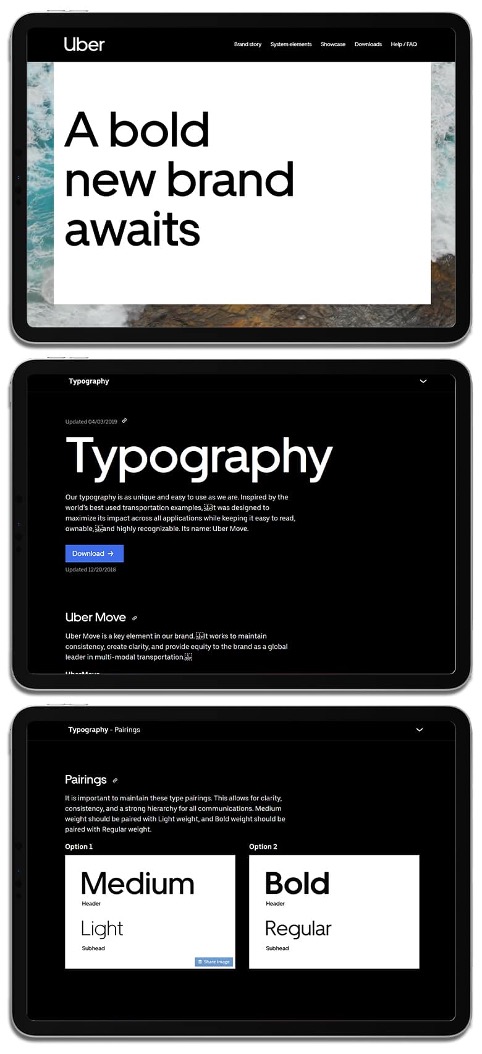
In the example, Uber typgraphy policy.
TYPE AND STYLE OF IMAGES
This is one of the most debated elements in companies that do not have art direction, because the temptation to choose what one likes based on personal taste instead of what is needed to strengthen the brand message is extremely strong and widespread.
The style of the photos can change a lot, in general once you have chosen the type of light, cold or warm depending on what you want to communicate, external photos or still life in the studio or, in general, the type of scenography (set photos or single product on a background) this style must be maintained to make the brand recognizable.
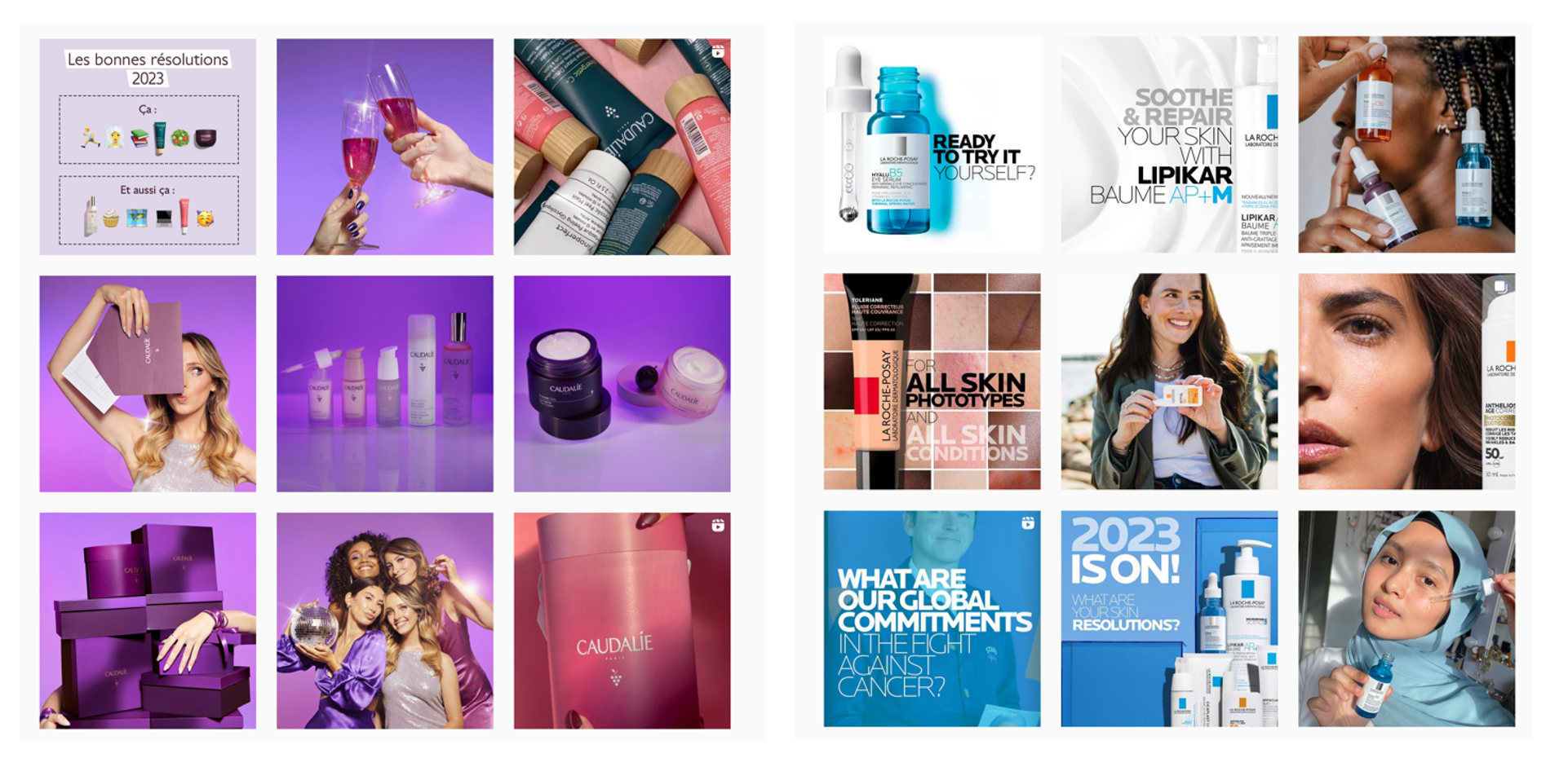
Regarding the subjects, if you choose images of people it is important to choose subjects in which customers can identify themselves, avoiding choosing models that are unattainable for inclusive and transversal brands. A good exercise is to compare the social pages of well-known brands to infer their image style. If we compare Caudalie with La Roche Posay, for example, the more glamorous and natural style of the former and the more scientific and rational one of the latter are also respected in the use of colours, the subjects of the photos and the settings.
PACKAGING
For a company that produces physical product, packaging and everything that accompanies it are essential for communication. In the food sector, for example, packaging is an increasingly exploited opportunity to convey different messages about the product and the company’s values.
This pack of biscuits by Misura, brand of the Italian group Colussi, for example, contains information regarding the production process, the ingredients, the commitment to sustainability, all in line with the rest of the brand image.

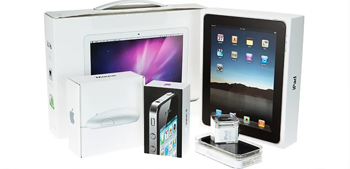
Even in the absence of messages, the holder itself is a communication tool, reinforcing brand appeal and desirability, as in these holders from Apple:
DESIGN – GRAPHIC ASPECT OF THE WEBSITE OR AN APP
As all the other elements seen so far, the important thing is to maintain consistency with what you intend to communicate and with your positioning. Let’s compare the following pictures:

Doctolib is a French platform for finding professionals in the health sector. It’s a transversal platform that is aimed at anyone and that must be extremely simple to be consulted even by the elderly or people with different levels of schooling. The simple and warm graphics, intuitive images and essential messages are consistent with Doctolib’s mission to appeal to everyone.
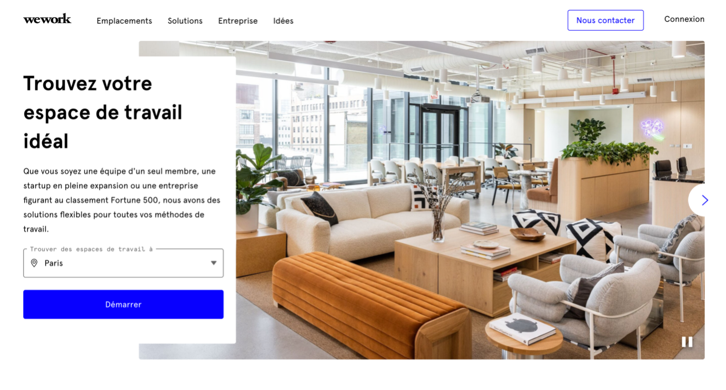
The opening page of Wework, on the other hand, immediately shows their positioning both with the reference in the text and with a more stylish image.
OTHER MARKETING SUPPORTS
Everything that has an image speaks. So whether it’s business cards, a presentation or a brochure, maintaining the key elements of the visual identity is the rule to follow.
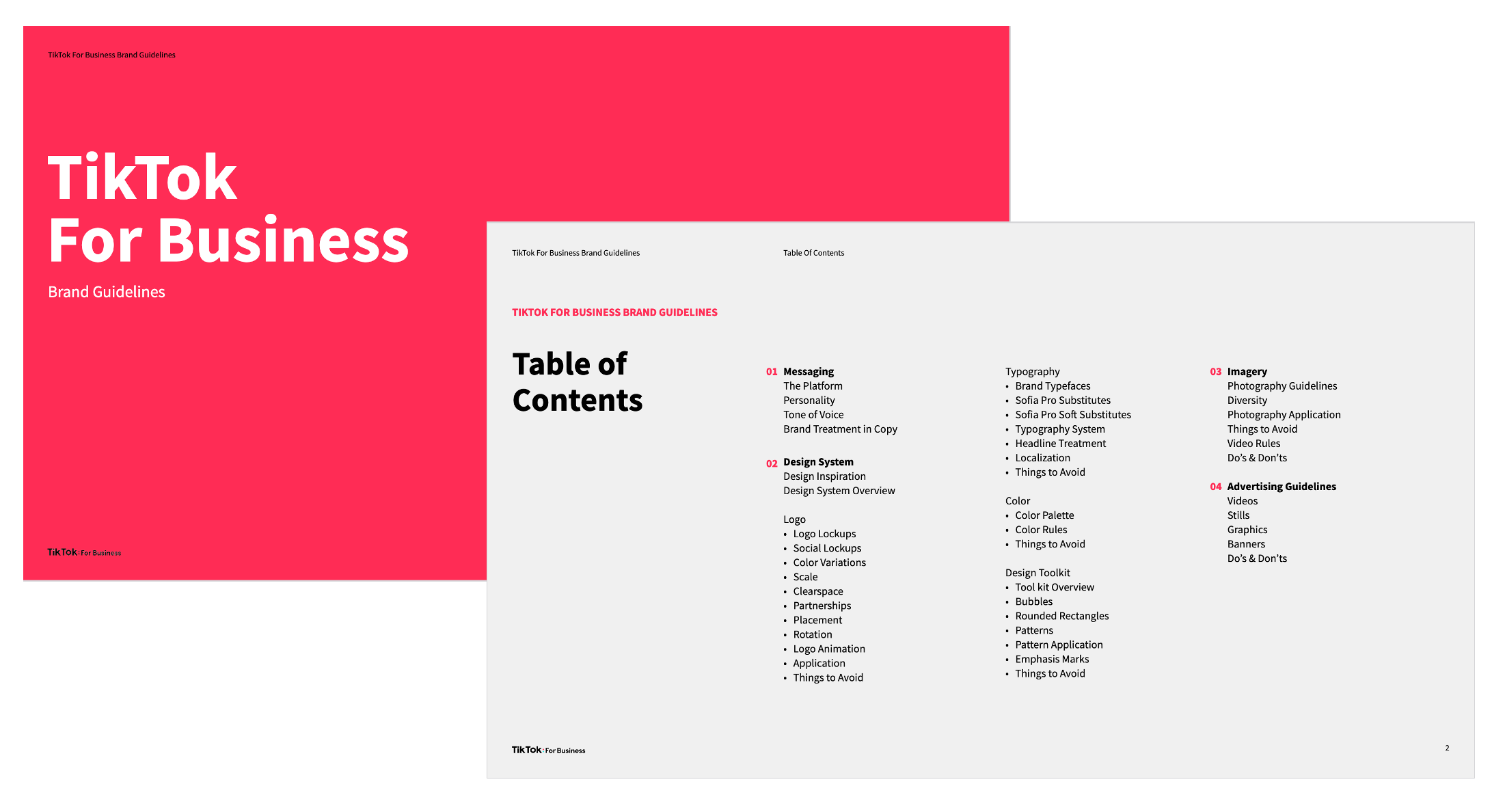
In general, companies explain their rules in a brand book, which collects the elements described above together with directions on what to do and what not to do in using the logo, font images, etc.
This is what the TikTok brand guidelines contains
To take a look on the entire document click here .
In the next article we will examine the communication channels, which ones and how to choose them according to company goals.
Related Posts
-

3 PILLARS OF STORY TELLING IN BUSINESS
21/05/2024 -
THE IMPORTANCE OF BRAND IDENTITY – Step 1
19/01/2023 -

Will Seo Kill Literature
02/11/2021 -

STORY TELLING
26/11/2019 -
Design Trends
29/09/2017